
Version History
All notable changes to the PoshUI project are documented here.
[1.4.1] - 2026-09-22
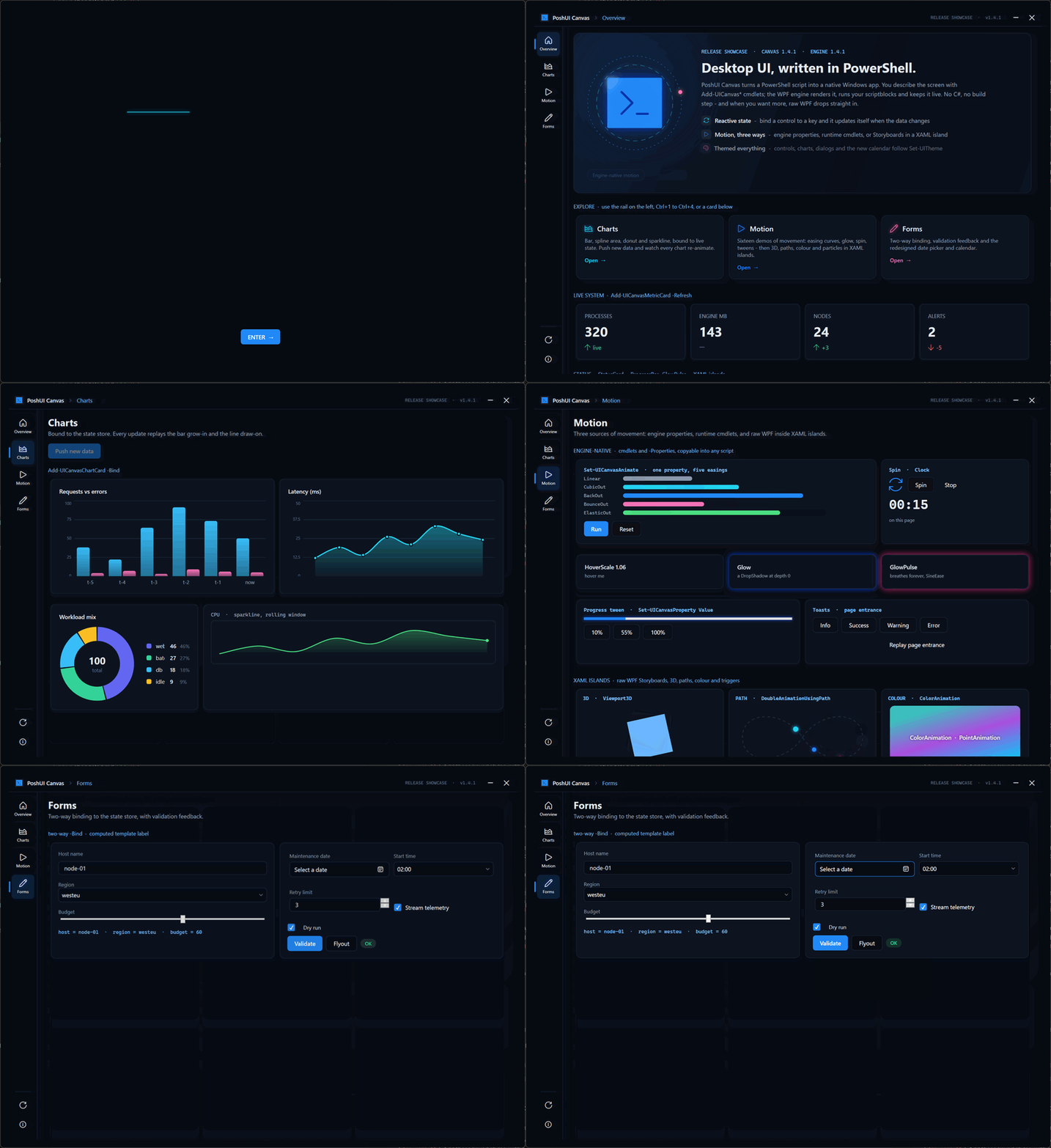
A polish release for Canvas. No cmdlet or parameter changed, so existing scripts run as they are. Every app that uses Add-UICanvasDatePicker gets the new look automatically. PoshUI.Canvas moves from 1.3.0 to 1.4.1, so the module and engine versions match again.
This is also the first signed release package since 1.3.1. 1.4.0 was never packaged, so the 1.4.1 download is the first to include PoshUI.Canvas and everything listed under 1.4.0 below.
A date picker that belongs in a dark app
The old picker had no style of its own, so Canvas fell back to the stock Windows one. That meant:
- a hard-coded white border around the text;
- the old gradient calendar icon;
- faint text on a translucent fill;
- a light calendar popup, even inside a dark app.
Colours set on the outer control never reached the calendar inside it.
Every part is now themed through Set-UITheme and follows light and dark mode:
- full-contrast day numbers;
- an accent-filled selected day and a ring on today;
- dimmed days from neighbouring months;
- chevron paging, and month and year views to match;
- an accent border when the field has focus.
Release showcase
Examples\Showcase-Release.ps1 in the release package shows Canvas at full stretch. An animated splash reveals the PoshUI lockup, then hands off to four sections behind a left icon rail (also Ctrl+1 to Ctrl+4):
- Overview: a hero panel, clickable explore cards and live metrics.
- Charts: bound to state. Push new data and watch every chart animate again.
- Motion: sixteen demos of movement, from
Set-UICanvasAnimateeasings, glow and spin, through to a 3D cube, motion along a curve, colour animation and a particle field in XAML islands. - Forms: two-way binding, validation feedback and the new calendar.
# from the extracted release folder
powershell -NoProfile -STA -File .\Examples\Showcase-Release.ps1
Motion guide
A new chapter, Animation & Motion, covers:
- what the engine animates for you, and where that stops;
- the XAML-island contract: storyboards must start themselves;
- the property paths that work, with a technique catalogue;
- easing and timing guidance;
- sequencing across pages;
- how to check that an animation works without watching it.
Fixed
- False
[unused property]warning forClockon elapsed-clock labels. The diagnostic's allow-list hadClockStopbut notClock. - Garbled AI context packs. Docs saved without a byte-order mark were read in the wrong encoding, so every em dash came out as
—. The packs now also include every numbered agent doc.
Known issue
Timers (-Refresh), state watchers and shortcuts registered on a page stay alive until the app closes, and are registered again each time you visit that page. If users navigate around a lot, throttle your tickers. The showcase shows the pattern.
[1.4.0] - 2026-09-13
PoshUI.Canvas — Free-Form Apps
A fourth module joins Wizard, Dashboard and Workflow. Where those give you an opinionated shell, Canvas gives you a blank page and ~75 cmdlets: lay out anything, anywhere, in a single .ps1. No XAML, no MVVM, no project scaffolding, no build step — the script is the application.
Import-Module PoshUI.Canvas
New-PoshUICanvas -Title 'Hello' -Theme Dark
Add-UICanvasPage -Title 'Home' -Layout VStack
Add-UICanvasTextBox -Name who -Value 'World'
Add-UICanvasButton 'Greet' -Style Accent -Action {
    Show-UICanvasToast -Message ("Hello, " + (Get-UICanvasValue -Name who))
}
Show-PoshUICanvas
Canvas covers the full WPF panel set (Grid, VStack, HStack, Wrap, Dock, absolute X/Y), ~55 control types, reactive state, charts, animation, toasts/dialogs/flyouts, secondary windows, keyboard shortcuts, and theming. A single page can express wizard, dashboard and workflow patterns together.
Engine-Native Workflow Runner — Add-UICanvasWorkflow -Engine
Canvas workflows can now run on the engine's workflow executor instead of as a composed script action. Steps execute on their own runspace, off the app's serialized gate — so progress and elapsed time stay live while a long step runs, instead of freezing until it completes.
- Per-step
-Retry,-TimeoutSeconds,-SkipWhen, and-ExpectedSeconds(weighted overall progress) - Engine-managed reboot-resume via
-StateFile— completed steps are pre-marked and the run continues - New
$wfstep context:UpdateProgress,WriteOutput,GetValue/SetValue,SetData/GetData,SkipTask,RequestReboot - The executor's runspace is seeded with the Canvas runtime cmdlets, so existing step scripts work unchanged
- Opt-in: without
-Enginethe previous behavior is preserved exactly, and the rendered UI is identical either way
Add-UICanvasWorkflowStep 'Download' -ExpectedSeconds 30 -Retry 2 -Script {
    1..10 | ForEach-Object { $wf.UpdateProgress($_ * 10, "downloading $($_*10)%"); Start-Sleep 1 }
}
Add-UICanvasWorkflow -Engine -Name deploy -AutoStart
ScriptCard — On-Demand Runner (Add-UICanvasScriptCard)
A dashboard card that runs a script off the UI gate in its own runspace, with a title, live status (Idle → Running → Done/Failed), a Run button, and a console that streams the script's output as it runs. Long tasks no longer block live -Refresh cards or other actions.
Add-UICanvasScriptCard 'Collect logs' -Detail 'Zips the last 24h' -Script {
    "starting..."; "done"
}
Fixed / improved
Add-UICanvasDataGridgained-OnChange, and the engine now raisesValueChangedwhen a grid row is selected. Selection was always readable viaGet-UICanvasValue, but nothing fired on select — so a grid could not drive a detail pane. Master/detail now works in any Canvas app.
Native Layout Controls — Tabs, Menu, GridSplitter, Viewbox
Four controls that previously required dropping to raw XAML are now first-class cmdlets.
Add-UICanvasTabs -Name main -Children {
    Add-UICanvasTab 'Summary' -Children { Add-UICanvasLabel 'hello' }
    Add-UICanvasTab 'Details' -Layout Grid -ColumnWidths '2*,Auto,3*' -Children {
        Add-UICanvasCard -Properties @{ Column = 0 } -Children { Add-UICanvasLabel 'left' }
        Add-UICanvasGridSplitter -Properties @{ Column = 1 }      # drag to resize both panes
        Add-UICanvasCard -Properties @{ Column = 2 } -Children { Add-UICanvasLabel 'right' }
    }
    Add-UICanvasTab 'Locked' -Disabled -Children { Add-UICanvasLabel 'unreachable' }
}Add-UICanvasTabs/Add-UICanvasTab— a tabbed container. Controls inside a tab are registered normally, soGet-UICanvasValue/Set-UICanvasValuereach them. The Tabs control's own value is the selected index, andSet-UICanvasValuealso accepts a tab's header text — so you can switch tabs from any action.Add-UICanvasMenu— a classic menu bar from nested-Items, with submenus to any depth, separators (Text = '-'), keyboard-gesture hints, icons, checkable and disabled entries. Each leaf'sActionfires like a button (or usePageto navigate).Add-UICanvasGridSplitter— drag handle that resizes adjacent Grid columns (or rows with-Orientation Horizontal). Place it in its own Grid cell between the two panes.Add-UICanvasViewbox— scales its content to fit the available space. Vector scaling, so text stays crisp.
MediaElement remains XAML-only via Add-UICanvasXaml (see the escape hatch).
Declarative Cascading Fields (-DependsOn / -OptionsScript)
Add-UICanvasDropdown and Add-UICanvasListBox can recompute their options whenever another field changes — no -OnChange wiring. Change-detected, so it never clobbers the user's current selection.
Add-UICanvasDropdown -Name region -Choices 'US','EU','APAC'
Add-UICanvasDropdown -Name dc -DependsOn region -OptionsScript {
    switch (Get-UICanvasValue -Name region) {
        'US' { 'us-east-1','us-west-2' }  'EU' { 'eu-central-1' }  'APAC' { 'ap-southeast-1' }
    }
}
Per-Monitor V2 DPI Awareness
The engine now declares Per-Monitor V2 DPI awareness. Previously it was only System-DPI-aware: crisp at the primary monitor's scaling, but Windows bitmap-stretched it (blurry text and controls) as soon as a window moved to a monitor using a different scale factor, with no way to recover short of restarting.
Windows now re-renders the window at the target monitor's DPI, so it stays sharp across mixed-DPI multi-monitor setups, adapts live when display scaling changes, and correctly scales the non-client area (title bar/borders) and child dialogs.
Sizes in Canvas were always logical units (1/96") rather than physical pixels — see Sizing, DPI & multiple monitors for the practical consequence: higher scaling leaves less logical space, so a 1080p laptop at 150% gives you only 1280×720 to lay out in. Prefer proportional layout and set -MinWidth/-MinHeight.
Fixed
- A workflow using
-SkipWhencould deadlock the whole app. The skip condition was evaluated synchronously on the UI thread, so a condition that called a bridge cmdlet (e.g.-SkipWhen '-not [bool](Get-UICanvasValue -Name x)') tried to marshal back to the very thread that was blocked waiting for it. The run froze with the previous step stuck on "RUNNING" and the window unresponsive. Conditions are now evaluated off the UI thread. - Dynamic item lists rendered as
System.Data.DataRowView. Setting a control'sItemsSourceat runtime to a list of strings wrapped each item in a DataView, because a string exposes aLengthproperty and was treated as a single-column row. Scalars (strings, numbers, booleans) now pass through as plain items. Get-UICanvasValuereturned$nullfor controls on a previous page. Values entered on an earlier page are snapshotted when navigating away, but the lookup only searched the currently-rendered controls. It now falls back to that snapshot, so cross-page reads work from any action.- Per-step progress bars and the overall gauge no longer attempt a two-way binding against read-only sources.
Documentation
- About Canvas — what Canvas is, how it works (authoring → engine → bridge), the four execution substrates, and the raw-XAML escape hatch
- Agent Authoring Guide — a self-contained context pack for building Canvas apps with an AI assistant, including the rules that prevent the common silent failures
- Capability Reference — terse index of every Canvas capability
[1.3.1] - 2026-06-18
Security hardening and bug fixes. No change to the public cmdlet API.
Security
- Script injection in the generator closed —
ConvertTo-UIScript(Wizard and Workflow) now emits every collected value through a single escaper instead of interpolating it into the generated script. - The value escaper itself repaired — its boolean branch used
return if (...), which threw at runtime. - Generated scripts are no longer written to a predictable path, and the temp directory's restrictive ACL is re-asserted on every use.
- Workflow state uses DPAPI authenticated encryption, and secret-named fields (password, token, credential and friends) are redacted before state is persisted.
-RequireSignedScriptscan no longer be downgraded by callingShow-*without it.
Fixed
- An
Add-UIOptionGroupattribute was dropped by a strayelsein the generator. - A
DateTimedefault was emitted twice, producing a malformed parameter declaration. Add-UIDateandAdd-UINumericsilently ignored-Default,-Minimum,-Maximumand-Increment.
Notes
Workflow state is written as POSHUI_STATE_V2. The modules read both V1 and V2, so an in-flight workflow survives the upgrade.
[1.3.0] - 2026-03-23
Dual-Mode Custom Themes & Theme Toggle
PoshUI now supports independent color palettes for light and dark modes via Set-UITheme -Light $hash -Dark $hash. Users can toggle between themes at runtime using the sun/moon button in the title bar, and custom colors persist across toggles.
22 overridable color slots: Background, ContentBackground, CardBackground, SidebarBackground, SidebarText, SidebarHighlight, TextPrimary, TextSecondary, AccentColor, ButtonBackground, ButtonForeground, InputBackground, InputBorder, BorderColor, TitleBarBackground, TitleBarText, SuccessColor, WarningColor, ErrorColor, HeadingForeground, BodyForeground, SecondaryForeground
Set-UITheme -Light @{
    Background       = '#FFF0F5'
    AccentColor      = '#E91E63'
    SidebarBackground = '#880E4F'
} -Dark @{
    Background       = '#1A1A2E'
    AccentColor      = '#00BFA5'
    SidebarBackground = '#0A1A18'
}
PNG Icon Support
All modules now support colored PNG/ICO images as icons, replacing or supplementing monochrome Segoe MDL2 glyphs.
Add-UIStep -IconPath- Sidebar step icons (Wizard, Dashboard, Workflow)Add-UIMetricCard -IconPath- Metric card icons (Dashboard)Add-UICard -IconPath- Info card icons (Dashboard)Add-UIBanner -IconPath- Banner overlay iconsSet-UIBranding -SidebarHeaderIcon- Full-color sidebar header logosSet-UIBranding -WindowTitleIcon- Window title bar icon
PNG icons fall back to glyph icons automatically if the file path is invalid.
New Examples
Test-CustomTheme-Dashboard.ps1- Dual-mode themes with PNG iconsTest-CustomTheme-Workflow.ps1- Dual-mode themes with PNG iconsWizard-EmojiIcons.ps1- PNG emoji icons in sidebar steps
Bug Fixes
- Theme toggle now re-applies custom color palettes when switching modes
ConvertTo-UIScriptcorrectly mapsIconPath,Icon, and other properties fromAdd-UICardJsonDefinitionLoaderextractsIconPathfrom card Properties dictionary
[1.0.0] - 2026-01-31
🎉 Initial Public Release
PoshUI v1.0.0 is the first public release of a PowerShell UI framework for building professional Windows 11-style wizards, dashboards, and workflows.
📦 Three Independent Modules
- PoshUI.Wizard: Step-by-step data collection with 12+ built-in controls
- PoshUI.Dashboard: Real-time monitoring with metric cards, charts, and tables
- PoshUI.Workflow: Multi-task automation with reboot/resume capability
🎯 Core Features
Dashboard Cards:
Add-UIMetricCard- KPI metrics with trends and targetsAdd-UIChartCard- Data visualization (Line, Bar, Area, Pie)Add-UITableCard- Tabular data displayAdd-UICard- Informational content
Developer Tools:
Get-PoshUIDashboard- Inspect and debug dashboard structure- BannerStyle presets - Simplified banner creation
- Verbose output - Detailed ScriptBlock execution feedback
- Enhanced error messages - Context-aware suggestions
Workflow Capabilities:
- Reboot & Resume - Workflows save state and continue after restart
- Auto-Progress - Progress bar updates from script output
- Workflow Context - Access
$PoshUIWorkflowin tasks
🏗️ Architecture
- JSON Serialization: Dashboard & Workflow modules use JSON for PowerShell-to-C# communication
- AST Parsing: Wizard module uses AST parsing for compatibility
- Shared Engine: All modules use the same WPF-based
PoshUI.exeengine - Zero Dependencies: No third-party libraries or NuGet packages
🧪 Testing
- 152 automated tests (58 PowerShell + 94 C#)
- Comprehensive test runners in
Tests/folder - CI/CD ready with JUnit XML output
📚 Documentation
- Complete cmdlet reference
- Dashboard cards reference
- Troubleshooting guide
- Working examples for all modules
- Get started guide
🎨 UI Features
- Light/Dark theme support with Auto detection
- Windows 11-style modern interface
- Live execution console
- Real-time data refresh
- Category filtering for cards
💻 Platform
- Windows PowerShell 5.1
- .NET Framework 4.8
- Windows 10/11 and Server 2016+
- Single executable distribution
Earlier releases (1.2.0, 1.1.0) are listed in CHANGELOG.md, which is the authoritative record.