
About Wizards
Wizards in PoshUI are designed for step-by-step data collection and guided workflows. They allow you to break down complex tasks into logical, manageable steps for your users.
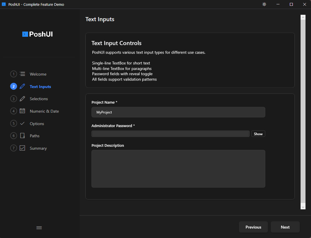
Full-color PNG emoji icons on every UI element (v1.3.0):
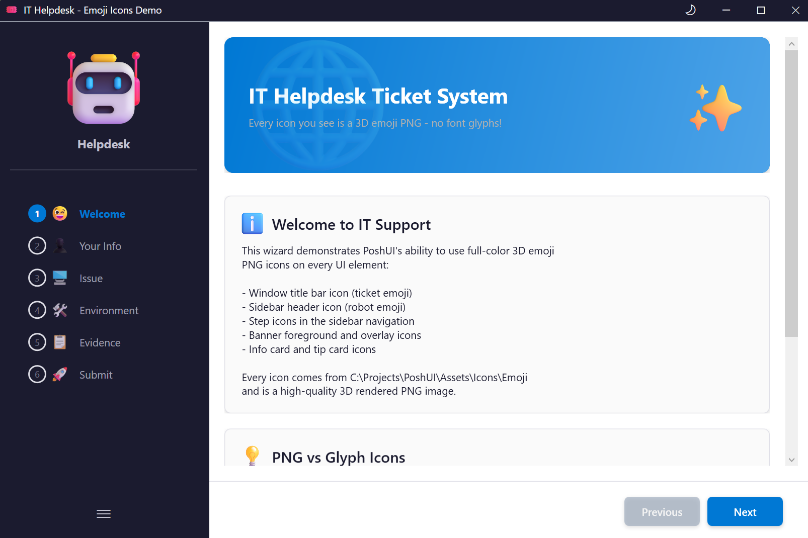
Key Features
- Step-by-Step Navigation: Guide users through a sequence of pages.
- Rich Control Set: Use over 12 different input controls including text boxes, dropdowns, and date pickers.
- Live Execution Mode: Execute PowerShell code in real-time during the wizard and show the output to the user.
- Validation: Ensure data integrity with built-in validation patterns and mandatory fields.
- Dynamic Content: Refresh controls based on user input (cascading dropdowns).
- Custom Branding: Personalize the wizard with your own titles, icons, and sidebar text.
- PNG Icon Support (v1.3.0): Full-color PNG/ICO icons on steps, cards, banners, and carousel slides.
- Dual-Mode Custom Themes (v1.3.0): Independent light/dark color palettes with runtime toggle.
- Theme Toggle (v1.3.0): Sun/moon button in the title bar for instant theme switching.
When to Use Wizards
Wizards are ideal for:
- Provisioning: Server setup, VM creation, or user onboarding.
- Deployments: Guided application or database deployments.
- Configurations: Complex settings that require multiple inputs.
- Self-Service: Tools for help desk or non-technical staff to perform automated tasks safely.
Workflow
A typical PoshUI Wizard follows this pattern:
- Initialize: Use
New-PoshUIWizardto start a new definition. - Define Steps: Add one or more steps using
Add-UIStep. - Add Controls: Populate each step with controls like
Add-UITextBoxorAdd-UIDropdown. - Execute: Display the UI using
Show-PoshUIWizard. - Process: Receive the user's input as a PowerShell object for further processing.
Next: Creating Wizards