
About Controls
PoshUI provides a rich set of interactive and display controls that you can use to build your wizards, dashboards, and workflows. These controls are the primary way users interact with your automation.
Control Categories
Controls are organized into several logical categories based on their function:
Input Controls
Collect text, numbers, or dates from the user.
- Text Controls: TextBox, MultiLine, Password.
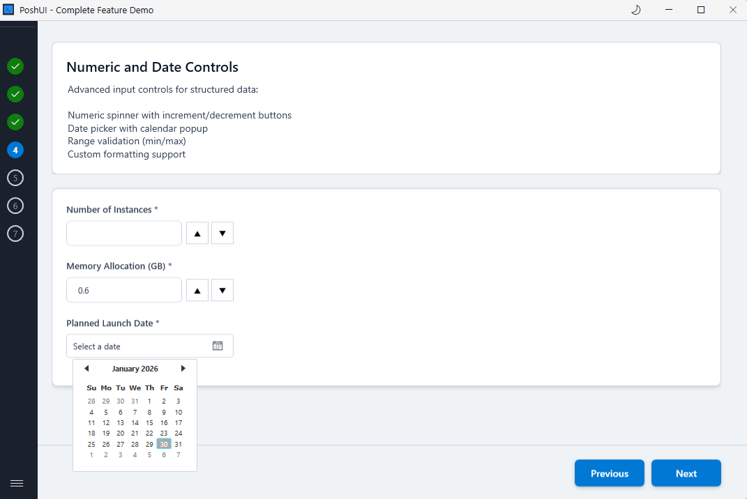
- Numeric & Date: Numeric (spinner), Date picker.
Selection Controls
Allow users to choose from predefined options.
- Selection Controls: Dropdown, ListBox, OptionGroup.
- Boolean Controls: Checkbox, Toggle.
Path Selection
Browse for files or folders on the local system.
- Path Controls: FilePath, FolderPath.
Display & Information
Show information, instructions, or banners without collecting input.
- Display Controls: Card, Banner.
Specialized Dashboard Cards
Exclusive to the Dashboard module for high-level monitoring.
- Visualization Cards: MetricCard, GraphCard, DataGridCard.
- Script Cards: Executable cards with auto-discovered parameters.
Common Parameters
Most input controls share a set of standard parameters:
| Parameter | Description |
|---|---|
-Step | The name of the step to add the control to. |
-Name | The unique identifier for the control (becomes the variable name in results). |
-Label | The display text shown next to or above the control. |
-Default | The initial value of the control when the UI opens. |
-Mandatory | Switch that makes the field required before proceeding. |
-HelpText | Optional tooltip text providing more context to the user. |
Dynamic Controls
Many selection controls support Dynamic Data Sources, allowing them to refresh their options based on the values of other controls in the wizard.
Next: Text Controls