
Selection Controls
Selection controls allow users to choose from a list of predefined options, ensuring consistency and preventing typing errors.
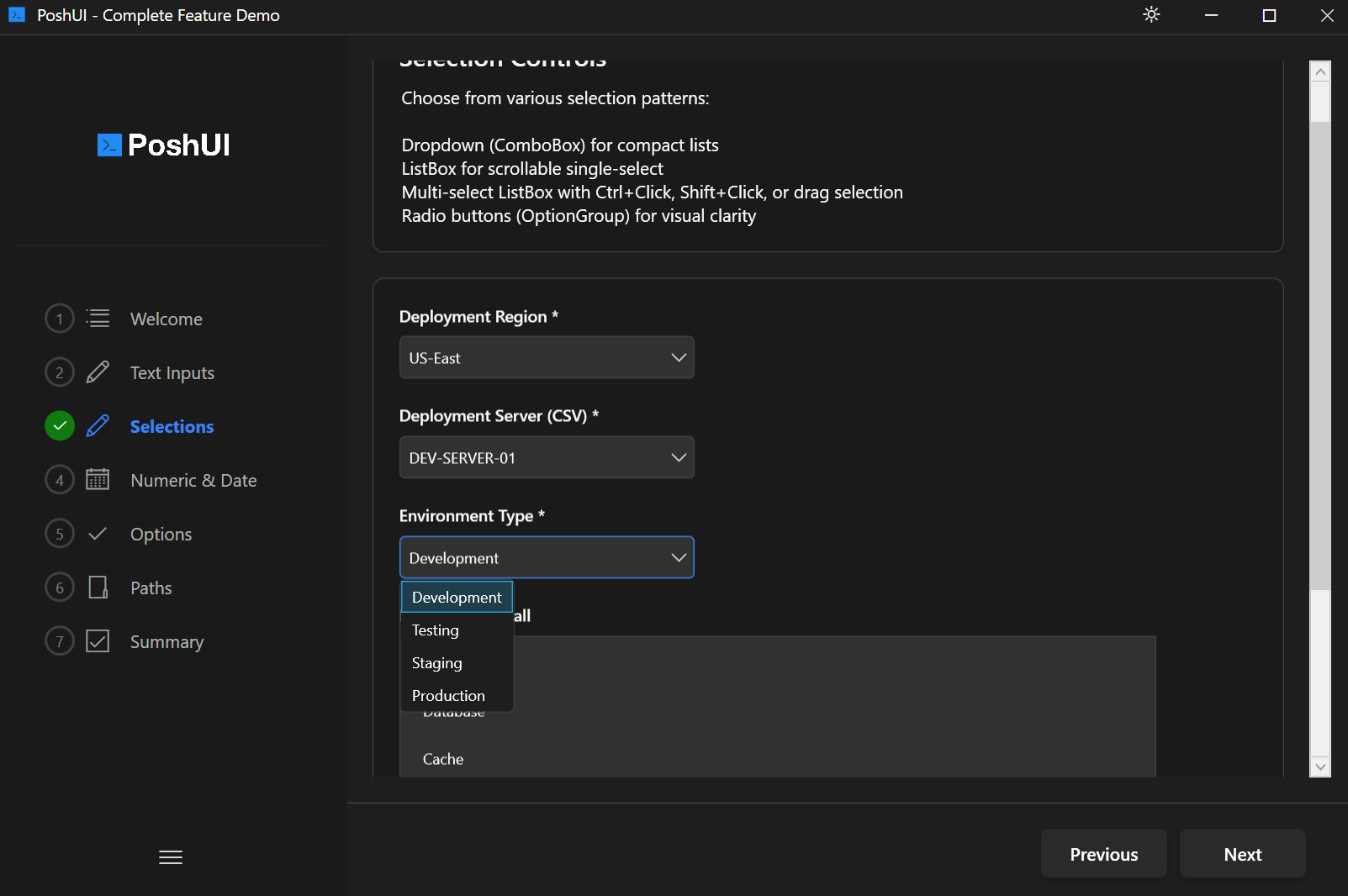
Dropdown
A compact control that shows the current selection and expands to show a list of options when clicked.
Basic Usage
powershell
Add-UIDropdown -Step 'Config' -Name 'Environment' -Label 'Target Environment' `
               -Choices @('Development', 'Staging', 'Production') `
               -Default 'Development'
Parameters
| Parameter | Type | Description |
|---|---|---|
-Choices | String[] | Array of values to display in the list. |
-Editable | Switch | Allows users to type a custom value not in the list. |
-ScriptBlock | ScriptBlock | Used for Dynamic Data Sources. |
ListBox
A scrollable list where one or more options are visible at all times.
Basic Usage
powershell
Add-UIListBox -Step 'Features' -Name 'OptionalFeatures' -Label 'Select Features' `
              -Choices @('Web Server', 'Database', 'Cache', 'Monitoring') `
              -MultiSelect
Parameters
| Parameter | Type | Description |
|---|---|---|
-MultiSelect | Switch | Allows selecting multiple items using Ctrl or Shift. |
-Choices | String[] | Array of values to display in the list. |
OptionGroup (Radio Buttons)
A set of mutually exclusive options where only one can be selected at a time. Ideal for small sets of 2-5 options.
Basic Usage
powershell
Add-UIOptionGroup -Step 'Config' -Name 'DeploymentType' -Label 'Deployment Type' `
                  -Options @('Standard', 'High Availability') `
                  -Orientation 'Horizontal'
Parameters
| Parameter | Type | Description |
|---|---|---|
-Options | String[] | Array of labels for the radio buttons. |
-Orientation | String | Layout of the buttons: 'Horizontal' or 'Vertical'. |
Next: Boolean Controls