
Platform Theming
PoshUI features a native Windows 11-style theming system that supports both Light and Dark modes. The theme can be configured to follow the system settings or forced to a specific style.
| Light Theme | Dark Theme |
|---|---|
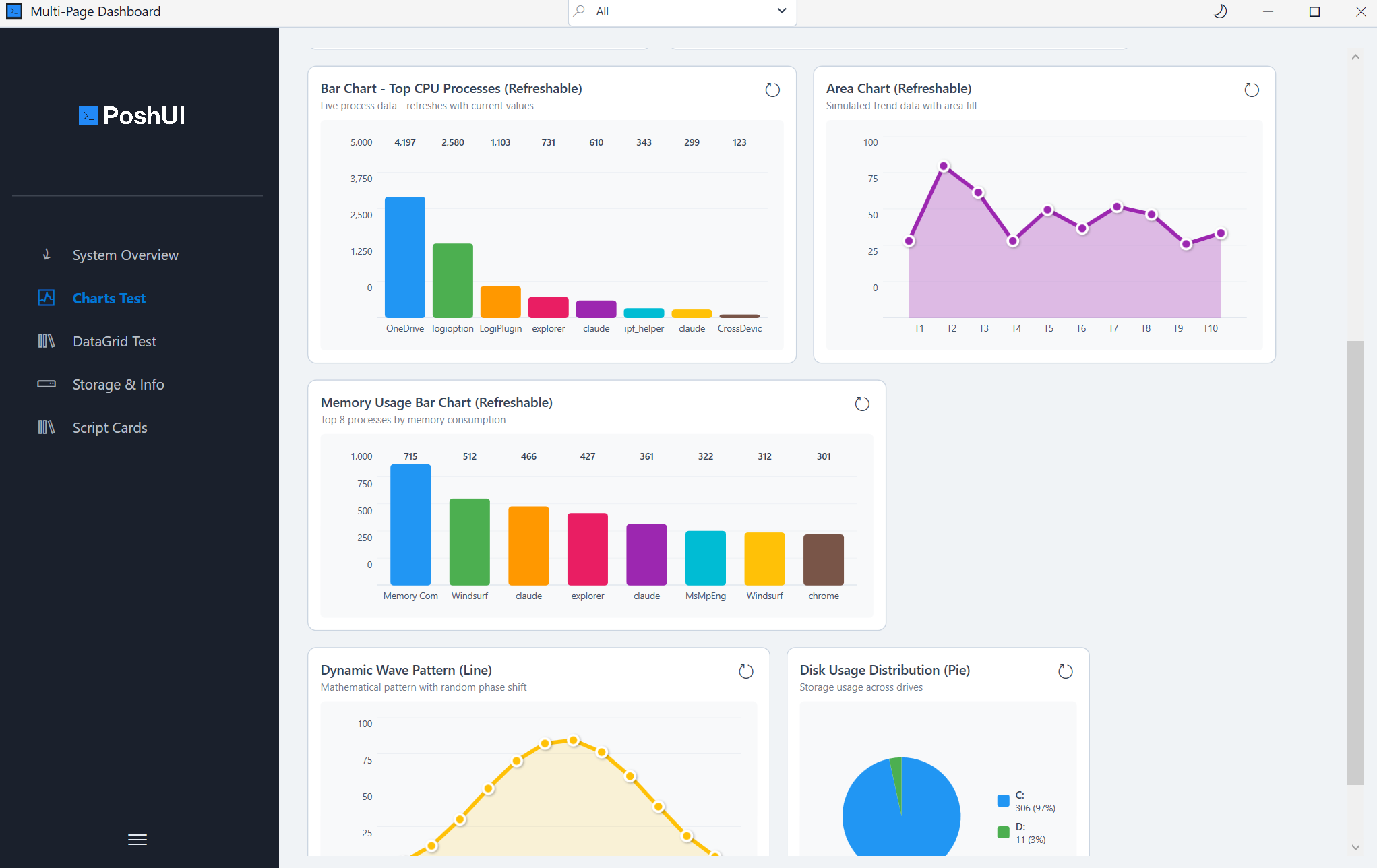 | 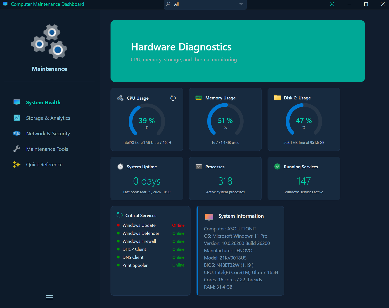 |
Theme Modes
| Mode | Description |
|---|---|
Auto | (Default) Automatically detects the Windows system theme from the registry. |
Light | Forces a high-contrast light theme with white backgrounds and grey borders. |
Dark | Forces a modern dark theme with deep charcoal backgrounds and vibrant accents. |
Setting the Theme
You can set the theme during initialization or later using branding cmdlets.
During Initialization
New-PoshUIWizard -Title "Setup" -Theme "Dark"Using Set-UIBranding
Set-UIBranding -Theme "Light"How It Works
The C# engine (PoshUI.exe) uses WPF ResourceDictionaries to manage themes. When the theme is set to Auto, the engine reads the following registry key to determine the user's preference:
- Key:
HKEY_CURRENT_USER\Software\Microsoft\Windows\CurrentVersion\Themes\Personalize - Value:
AppsUseLightTheme(0 = Dark, 1 = Light)
UI Elements Affected
The theming system applies consistently to all visual elements:
- Window Chrome: Title bar and borders.
- Sidebar: Background, selection highlights, and text.
- Form Controls: Backgrounds, borders, focus states, and placeholder text.
- Dashboard Cards: Backgrounds, shadows, and metric values.
- Execution Console: Background and text colors (optimized for readability).
Theme Toggle (v1.3.0)
A sun/moon toggle button in the title bar allows users to switch between light and dark themes at runtime. The toggle is always available and works with both built-in and custom themes.
Dual-Mode Custom Themes (v1.3.0)
Use Set-UITheme to define independent color palettes for light and dark modes. The engine applies the correct palette automatically based on the active theme, and custom colors persist when the user toggles between modes.
# Define different palettes for each mode
Set-UITheme -Light @{
    Background        = '#FFF0F5'
    AccentColor       = '#E91E63'
    SidebarBackground = '#880E4F'
    SidebarText       = '#FFFFFF'
    ButtonBackground  = '#E91E63'
} -Dark @{
    Background        = '#1A1A2E'
    AccentColor       = '#00BFA5'
    SidebarBackground = '#0A1A18'
    SidebarText       = '#E0F2F1'
    ButtonBackground  = '#00BFA5'
}
Available Color Slots
| Slot | Description |
|---|---|
Background | Outermost window background |
ContentBackground | Main content area background |
CardBackground | Card surface color |
SidebarBackground | Sidebar panel background |
SidebarText | Sidebar text color |
SidebarHighlight | Active sidebar item highlight |
TextPrimary | Primary text color |
TextSecondary | Secondary/muted text |
AccentColor | Primary accent (buttons, highlights) |
ButtonBackground | Button fill color |
ButtonForeground | Button text color |
InputBackground | Text input background |
InputBorder | Text input border |
BorderColor | General border color |
TitleBarBackground | Title bar background |
TitleBarText | Title bar text |
SuccessColor | Success state indicators |
WarningColor | Warning state indicators |
ErrorColor | Error state indicators |
HeadingForeground | Heading text color |
BodyForeground | Body text color |
SecondaryForeground | Secondary text color |
Only specify the slots you want to override. Unspecified slots use the built-in theme defaults.
Custom Colors on Controls
Some controls also accept custom hex color overrides directly:
Add-UICard -Step 'Config' -Title 'Success' -BackgroundColor '#0078D4' -ContentColor '#FFFFFF'TIP
When using custom colors, ensure they maintain high contrast for accessibility in both light and dark environments.
Next: Validation